Robin Assistant

Robin Assistant

Industry

Health

Client

Robin assistant

Service

UX/UI Design and development

Date

February 2022

Robin Assistant is a smart digital helper that supports you with tasks, schedules, and questions. It makes your work and daily life more efficient.


shape
shape
shape

Client

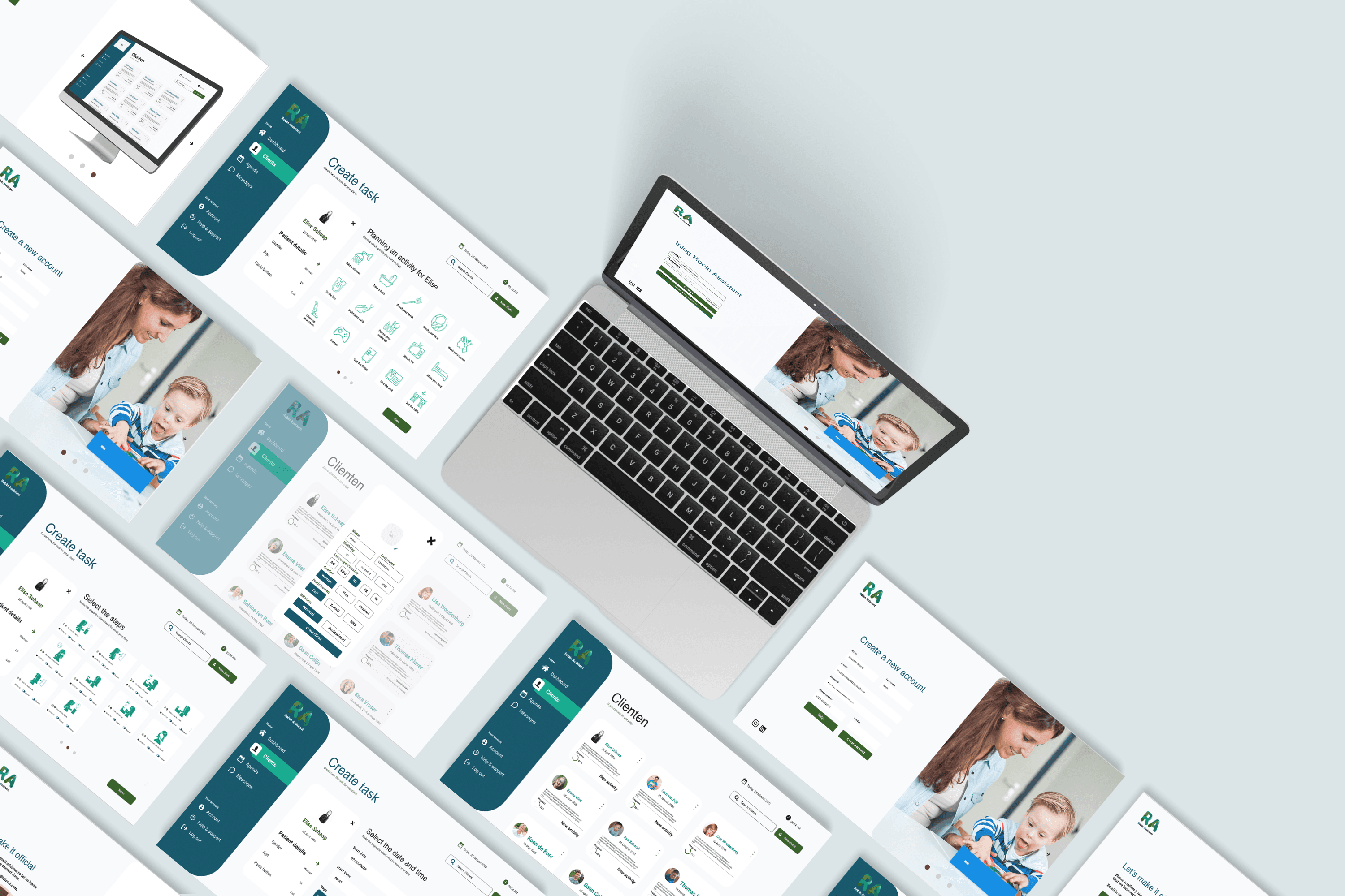
Robin Assistant is software designed to make daily routines easier for both patients and caregivers, allowing caregivers to create a complete schedule for patients step by step. As part of the redesign, the goal was to create a more user-friendly and faster platform, enabling caregivers to more easily create accounts for different patients. Our brief was to refine one aspect of the Robin Assistant dashboard, focusing on honing the look and feel to perfection within a single sprint of four weeks. We chose to remake the process of adding a client to the system, as it marks the beginning of the cycle and required the most significant makeover.

My Part

My role in the project was to completely redesign the online platform. In a team of three—a software developer, a graphic designer, and a UX designer—I contributed my expertise. As the UX designer, I was responsible for creating interactive wireframes and worked closely with the software developer. Additionally, I conducted various studies on patients with Down syndrome to provide a clear understanding of the specific needs of both patients and caregivers.

The Journey of Design

The Journey of Design

In collaboration with the graphic designer, I conducted extensive research on existing platforms. Over the years, various healthcare platforms have been developed, with a primary focus on how patients perceive the program. For us, the emphasis was on creating a platform that is accessible for both patients and caregivers.

In collaboration with the graphic designer, I conducted extensive research on existing platforms. Over the years, various healthcare platforms have been developed, with a primary focus on how patients perceive the program. For us, the emphasis was on creating a platform that is accessible for both patients and caregivers.

Matching Style

Matching Style

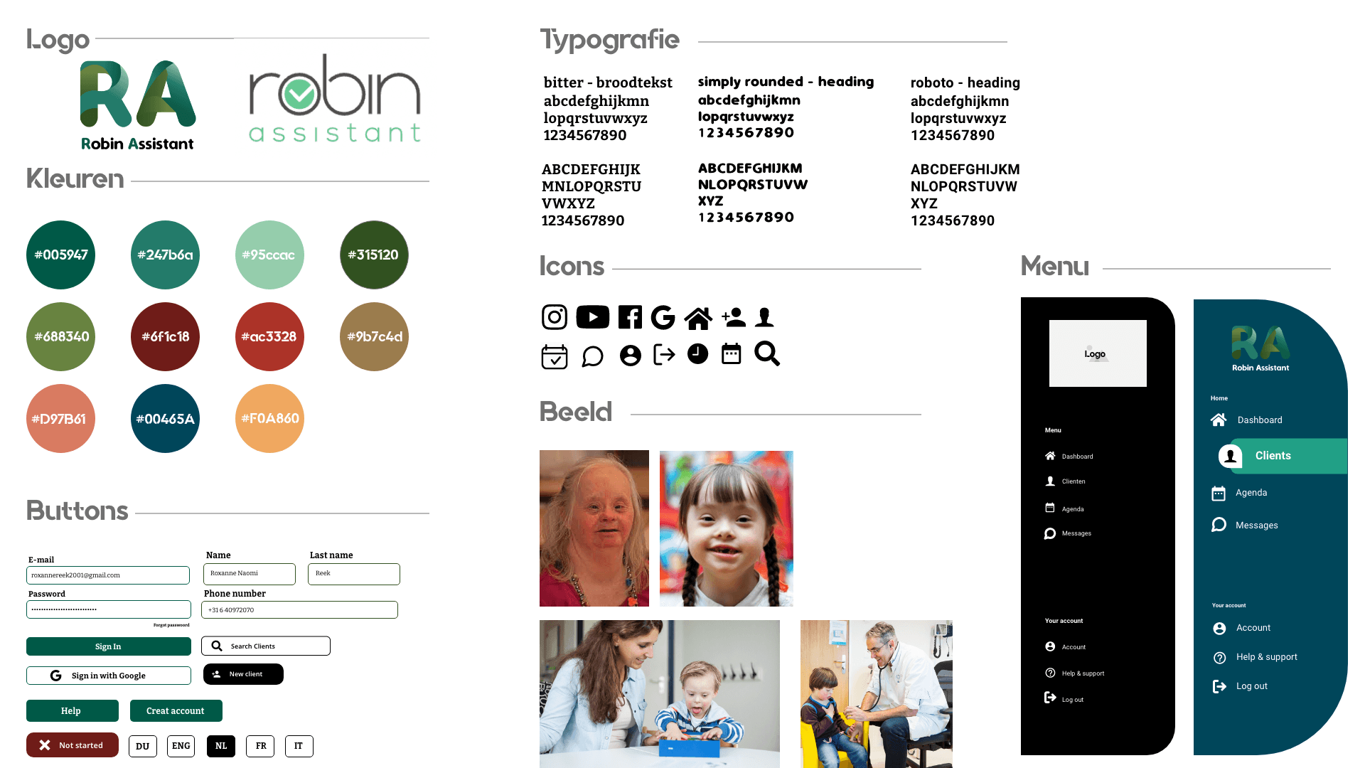
For Robin Assistant, we created a style guide that is easy to use. We chose calm colors and large, clear images to make it easier for people with Down syndrome to recognize. This makes it easier to quickly understand information. Our goal is to provide a pleasant and simple experience for everyone, ensuring that our services are accessible to all.

For Robin Assistant, we created a style guide that is easy to use. We chose calm colors and large, clear images to make it easier for people with Down syndrome to recognize. This makes it easier to quickly understand information. Our goal is to provide a pleasant and simple experience for everyone, ensuring that our services are accessible to all.

User needs

Must have

To create a clear plan for their clients

Must have

To create a clear plan for their clients

Must have

caregivers can establish tasks with step-by-step instructions.

Must have

caregivers can establish tasks with step-by-step instructions.

Must have

The client pages are available in multiple languages, including English, Spanish, Arabic, and Dutch.

Must have

The client pages are available in multiple languages, including English, Spanish, Arabic, and Dutch.

Should have

All clients can be viewed on a clear, organized page

Should have

All clients can be viewed on a clear, organized page

Should have

A panic button can be created for clients.

Should have

A panic button can be created for clients.

Should have

he process overview is quick and easy to maintain.

Should have

he process overview is quick and easy to maintain.

Finished product

Finished product

Finishedproduct

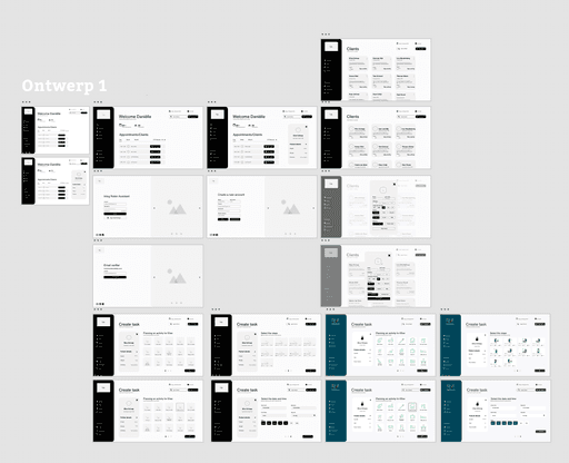
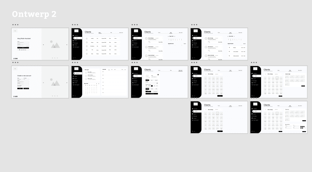
In designing the wireframes, the primary focus was on instilling a sense of trust and reliability for the caregiver. This was taken into account both in the style and the development of the dashboard. Therefore, designs were created for both iPad and computer interfaces, ensuring that the dashboard is easily portable for caregivers when visiting clients. We designed a step-by-step system to ensure clarity for caregivers, enabling them to create patient plans even during busy periods without missing any steps. The biggest challenge lay in the differences between iPad and desktop designs. We utilized large elements, which sometimes caused certain elements to be obscured on the iPad. By establishing clear priorities, we were able to achieve consistency across the designs, ensuring a cohesive user experience. As a team, we developed and presented two designs to the client, highlighting their pros and cons. Ultimately, Design 2 became the final product, further developed in collaboration with Mees (software developer).

In designing the wireframes, the primary focus was on instilling a sense of trust and reliability for the caregiver. This was taken into account both in the style and the development of the dashboard. Therefore, designs were created for both iPad and computer interfaces, ensuring that the dashboard is easily portable for caregivers when visiting clients. We designed a step-by-step system to ensure clarity for caregivers, enabling them to create patient plans even during busy periods without missing any steps. The biggest challenge lay in the differences between iPad and desktop designs. We utilized large elements, which sometimes caused certain elements to be obscured on the iPad. By establishing clear priorities, we were able to achieve consistency across the designs, ensuring a cohesive user experience. As a team, we developed and presented two designs to the client, highlighting their pros and cons. Ultimately, Design 2 became the final product, further developed in collaboration with Mees (software developer).

RELATED PROJECTS

abstract
abstract
abstract
  • In

  • Insta

  • In

  • Insta

  • In

  • Insta

  • In

  • Insta