New Designers Journey

New Designers Journey

Industry

Design

Client

New Designers

Service

Graphic Design

Date

March 2025

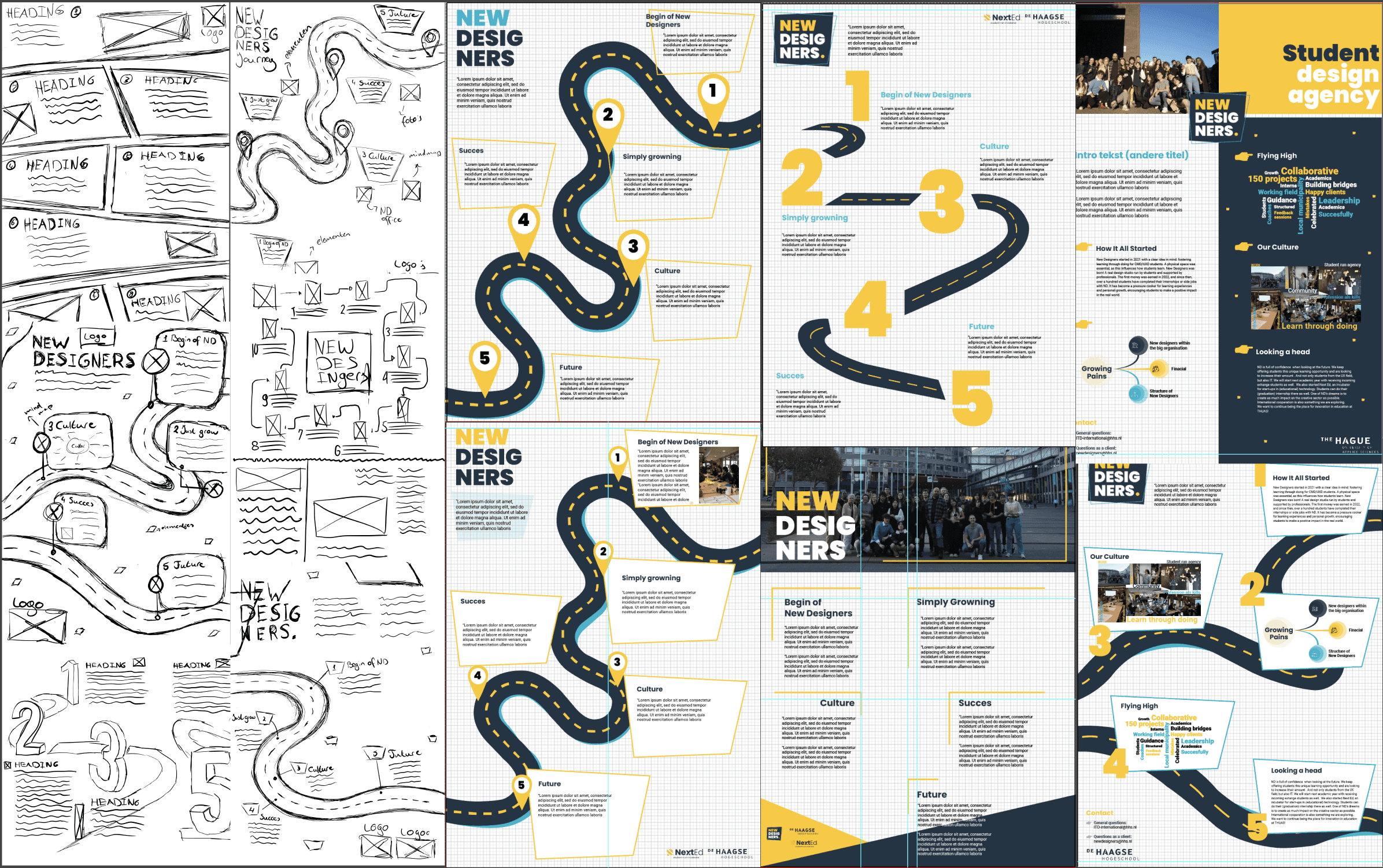
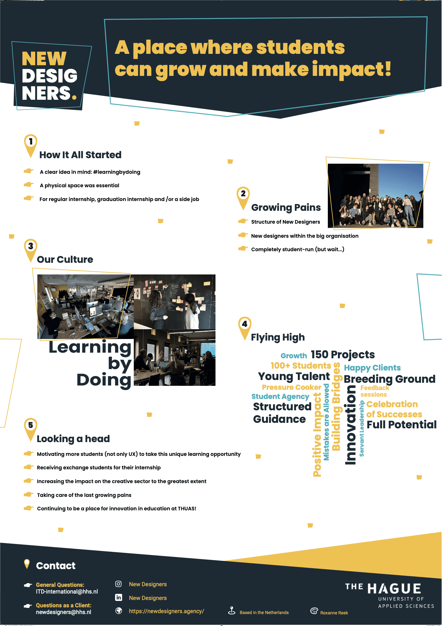
I designed a poster for New Designers that visually represented a storyline the designers could use during their presentation.

abstract
abstract
abstract

Client

New Designers is a student-run agency within The Hague University of Applied Sciences, dedicated to bridging the gap between education and the professional design industry. Managed by ambitious Communication & Multimedia Design students, the agency offers creative solutions in UX/UI design, branding, and digital experiences. For this project, I was tasked with designing a poster that visually represents the journey New Designers takes as an agency. The poster needed to clearly illustrate the path they navigate, from concept to execution, highlighting their growth and impact. Ultimately, the design was showcased at a conference in Finland, presenting New Designers to an international audience.

My Part

During this project, my job was to explore the journey New Designers has been on over the past few years and translate it into a visually engaging poster. The goal was to illustrate the path the agency has taken, highlighting its growth, challenges, and achievements. I was given a lot of creative freedom, allowing me to develop my own vision and interpret New Designers from my perspective as a freelancer. This approach enabled me to blend storytelling with design, capturing the essence of the agency in a way that resonates with both students and professionals. The final poster was showcased at a conference in Finland, presenting New Designers to an international audience and emphasizing its role in bridging education and the creative industry.

The Journey of Design

The Journey of Design

I started designing my New Designers poster by sketching ideas on paper to explore different layouts and compositions. Then, I experimented with various color combinations to find the right balance and visual impact. After selecting a direction, I moved on to digital sketches, refining the design with more precision. Printing multiple versions allowed me to test different variations and see how they looked in real life. Throughout the process, I had frequent discussions with the client to ensure the design aligned with their vision and expectations.

I started designing my New Designers poster by sketching ideas on paper to explore different layouts and compositions. Then, I experimented with various color combinations to find the right balance and visual impact. After selecting a direction, I moved on to digital sketches, refining the design with more precision. Printing multiple versions allowed me to test different variations and see how they looked in real life. Throughout the process, I had frequent discussions with the client to ensure the design aligned with their vision and expectations.

Matching Style

Matching Style

New Designers already has its own distinct style, but I had the freedom to be highly creative and introduce new elements. These elements needed to align with the visual identity of De Haagse Hogeschool while still feeling fresh and innovative. A key aspect of the design was showcasing a journey, which I brought to life through a creative use of pinpoints and a dynamic route. This approach made the concept of exploration and progress visually clear. By blending creativity with structure, I ensured the poster fit seamlessly within the existing style while adding a unique touch.

New Designers already has its own distinct style, but I had the freedom to be highly creative and introduce new elements. These elements needed to align with the visual identity of De Haagse Hogeschool while still feeling fresh and innovative. A key aspect of the design was showcasing a journey, which I brought to life through a creative use of pinpoints and a dynamic route. This approach made the concept of exploration and progress visually clear. By blending creativity with structure, I ensured the poster fit seamlessly within the existing style while adding a unique touch.

User needs

Must have

The journey must be creatively and understandably

Must have

The journey must be creatively and understandably

Must have

The design must align with the existing branding, including colors, typography, and visual style.

Must have

The design must align with the existing branding, including colors, typography, and visual style.

Must have

The design should be innovative while showing the ups and downs

Must have

The design should be innovative while showing the ups and downs

Should have

The possibility of making the journey digital or interactive in some way.

Should have

The possibility of making the journey digital or interactive in some way.

Should have

Playful compositions and shapes that convey movement and progress.

Should have

Playful compositions and shapes that convey movement and progress.

Should have

A clear structure in the design, ensuring that viewers immediately grasp the key information.

Should have

A clear structure in the design, ensuring that viewers immediately grasp the key information.

Finished product

Finished product

Finishedproduct

For this project, we explored various design concepts, aiming to creatively depict a path representing the journey of New Designers. Initially, we experimented with different ways to integrate a road into the design, but the result became too visually overwhelming. To refine the concept while maintaining the essence of New Designers, we explored alternative creative approaches. The final design embraces the established ND poster layout while subtly incorporating the route within it. Key elements from earlier iterations were carefully retained, ensuring a dynamic yet balanced composition that reflects the spirit of New Designers. This project was particularly special for me, as it was my first major solo assignment for ND. I was incredibly proud to have been given this opportunity. The fact that the final design was even taken to Finland (see photo 1), where it became the official ND business card, made me feel a little extra proud. It was a moment of recognition that truly validated my work and creativity.

For this project, we explored various design concepts, aiming to creatively depict a path representing the journey of New Designers. Initially, we experimented with different ways to integrate a road into the design, but the result became too visually overwhelming. To refine the concept while maintaining the essence of New Designers, we explored alternative creative approaches. The final design embraces the established ND poster layout while subtly incorporating the route within it. Key elements from earlier iterations were carefully retained, ensuring a dynamic yet balanced composition that reflects the spirit of New Designers. This project was particularly special for me, as it was my first major solo assignment for ND. I was incredibly proud to have been given this opportunity. The fact that the final design was even taken to Finland (see photo 1), where it became the official ND business card, made me feel a little extra proud. It was a moment of recognition that truly validated my work and creativity.

RELATED PROJECTS

shape
shape
shape
  • In

  • Insta

  • In

  • Insta

  • In

  • Insta

  • In

  • Insta